How to Create a Home You’ll Still Love Years From Now
We’ve all been there. You save dozens of beautiful interiors on Pinterest, fall in love with a trending paint color, and imagine how incredible it will look in your own home. Then, months later, something feels… off.
The problem usually isn’t the color itself. It’s the process.
The most timeless homes aren’t built around the paint aisle. They’re built around thoughtful decisions that consider light, materials, architecture, and the way people actually live. That’s why professionally designed interiors often feel effortlessly cohesive, while DIY projects can sometimes feel like a collection of beautiful pieces that never quite belong together.
If you’re about to redecorate, this guide will help you choose a color palette you’ll love long after today’s trends have faded.
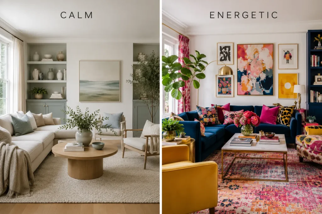
Start With the Feeling, Not the Paint
Before looking at a single paint swatch, ask yourself one simple question:
How do you want this room to feel?
Color is emotional. It shapes the atmosphere long before anyone notices your furniture or décor.
Think about words rather than colors:
- Calm
- Cozy
- Bright
- Airy
- Sophisticated
- Warm
- Luxurious
- Playful
- Dramatic
A serene bedroom and an energetic home office shouldn’t share the same palette simply because you like sage green.
Professional designers often begin with emotion and lifestyle, then translate those feelings into colors, textures, and materials.
Designer Tip: Great color palettes begin with a mood, not a paint chip.
Choose Your Permanent Elements First
One of the biggest decorating mistakes is choosing paint before anything else.
Paint is actually one of the easiest—and least expensive—things to change.
Instead, start with the elements that will stay in your home for years:
- Flooring
- Kitchen cabinets
- Countertops
- Fireplace stone
- Large sofas
- Built-in shelving
- Wood finishes
These fixed elements create the foundation of your palette.
For example, cool gray flooring naturally pairs better with cool-toned colors, while warm oak flooring often feels most harmonious with earthy neutrals, creams, and warm whites.
Rather than fighting these permanent features, let them guide your decisions.
Build Your Palette Around One Anchor Color
Many homeowners try to combine several favorite colors into one room.
The result often feels busy and disconnected.
Instead, choose one anchor color that becomes the visual foundation of the space.
This could come from:
- A sofa
- A vintage rug
- Artwork
- A patterned fabric
- A beautiful stone countertop
- Statement curtains
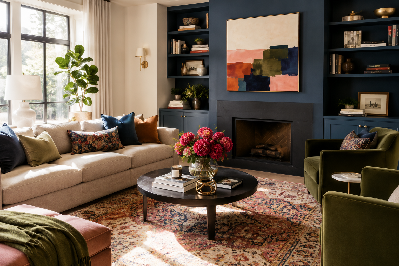
Once you’ve chosen your anchor, every other color should support it rather than compete with it.
This simple shift creates interiors that feel intentional instead of accidental.
Limit Yourself to Three Main Colors
One of the easiest ways to make a room feel professionally designed is to simplify your palette.
A classic approach includes:
- One dominant color (walls or large furniture)
- One secondary color (textiles, cabinetry, or rugs)
- One accent color (decorative accessories)
Instead of introducing six different colors, create interest by using different shades, textures, and finishes.
A restrained palette almost always looks more expensive than an overly colorful one.
Repeat Every Color at Least Three Times
Ever notice how one random green pillow can feel completely out of place?
That’s because our eyes naturally look for repetition.
Whenever you introduce a color, repeat it in at least three places throughout the room.
For example, green could appear in:
- Throw pillows
- Indoor plants
- Artwork
Or black might show up in:
- Picture frames
- Lighting
- Furniture legs
Repeating colors creates rhythm, making the entire space feel cohesive without anyone noticing why.
Think About Light Before Choosing Paint
Paint doesn’t exist in isolation.
The same color can look dramatically different depending on the room.
Consider:
North-facing rooms
Receive cooler, softer light that can make colors appear grayer.
South-facing rooms
Enjoy warm natural light that enhances creamy and earthy tones.
Morning light
Feels fresh and cool.
Evening light
Often becomes warmer and more golden.
Never choose paint based solely on a tiny sample in a store.
Always evaluate it inside your own home throughout the day.
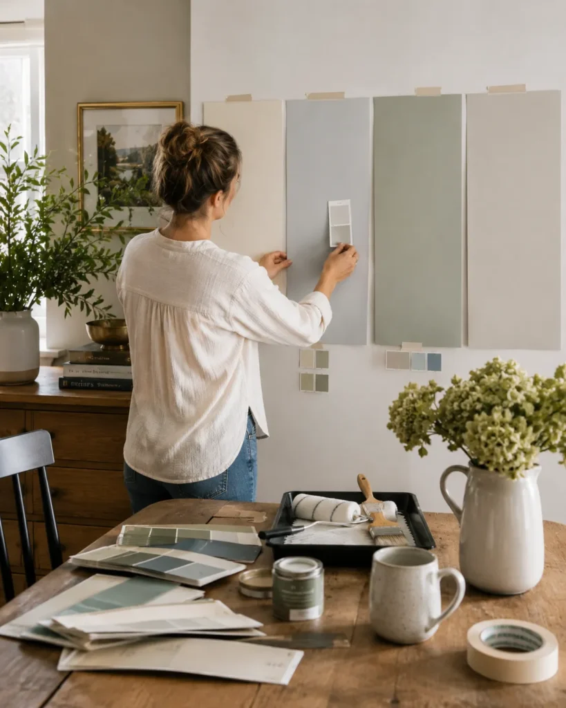
Test Paint the Right Way
Tiny paint chips rarely tell the whole story.
Instead of painting a small square directly on the wall, try this designer-approved method:
- Paint large sample boards.
- Move them around the room.
- View them in natural daylight.
- Check them at night with your lamps on.
- Compare them against flooring, furniture, and fabrics.
You might be surprised how differently the exact same paint color behaves under changing light conditions.
Testing before committing can save both money and frustration.
Don’t Chase Every Color Trend
Every few years, one color seems to dominate social media.
Yesterday it was cool gray.
Then all-white interiors.
Then navy kitchens.
Now it’s sage green and earthy browns.
Trends can be inspiring, but they shouldn’t dictate your entire home.
Instead, keep your foundational colors timeless and experiment with trends through pieces that are easy to replace:
- Pillows
- Throws
- Vases
- Artwork
- Candles
- Decorative objects
This allows your home to evolve without requiring a complete redesign every time trends change.
Create Depth With Different Shades
A beautiful room doesn’t necessarily use more colors.
It often uses fewer colors—with greater variation.
Imagine a palette built around warm neutrals:
- Soft ivory
- Warm white
- Greige
- Taupe
- Walnut
- Charcoal
Although these colors belong to the same family, the variation creates richness, depth, and sophistication.
Layering tones is one of the easiest ways to make a home feel elevated without making it feel busy.
Leave Room for Your Home to Evolve
Your home isn’t a showroom.
It grows with you.
You’ll collect books, travel souvenirs, artwork, family photographs, plants, vintage finds, and meaningful objects over time.
A successful color palette should provide a flexible backdrop that allows those personal touches to shine.
Instead of designing for perfection, design for longevity.
The goal isn’t to freeze your home in one beautiful moment—it’s to create a foundation that still feels beautiful years from now.
Designer Checklist
Before committing to your palette, ask yourself:
✔ Have I decided how I want the room to feel?
✔ Have I considered my flooring, cabinetry, and other permanent finishes?
✔ Do I have one clear anchor color?
✔ Am I limiting my palette to three primary colors?
✔ Does every color appear multiple times throughout the room?
✔ Have I tested paint in different lighting conditions?
✔ Am I using trendy colors only where they’re easy to replace?
✔ Am I creating depth through shades rather than adding more colors?
Final Thoughts
The homes that leave a lasting impression rarely rely on bold colors or fleeting trends. Instead, they feel balanced, intentional, and deeply personal.
Choosing a color palette isn’t about finding the “perfect” shade of paint. It’s about creating harmony between your home’s architecture, natural light, materials, and the life unfolding within its walls.
When you start with the feeling you want to create—and let every color support that vision—you’ll end up with a home that feels just as beautiful years from now as it does on the day the paint dries.