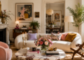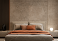

Walk into the most expensive-feeling home you’ve ever visited and try to name the furniture. You probably can’t. What you remember instead is a feeling — calm, considered, unhurried — and you probably assumed that feeling came from money. It didn’t, not directly. It came from a set of decisions that have almost nothing to do with what anything cost.
That’s the part about quiet luxury nobody explains clearly. It borrowed its name from fashion’s “old money” moment — the logo-free blazers, the unmarked leather bags, the clothes that look expensive precisely because they refuse to announce themselves. Applied to a home, the same idea holds: the rooms that read as genuinely luxurious are almost never the ones working hardest to prove it.
Once you see the actual mechanics behind this, you start noticing which homes are doing it and which ones are just loud.
What Quiet Luxury Actually Means in a Home
The fashion version of quiet luxury is built on a simple premise: quality announces itself without needing a logo to do it. A cashmere sweater with no visible branding still feels different in your hands than a synthetic one covered in a monogram. The good sweater doesn’t need the monogram. That confidence — needing no confirmation — is the entire aesthetic.
In a home, this translates directly. A quiet luxury interior communicates its quality through the weight of a door handle, the drape of a curtain, the way a sofa holds its shape after months of use — not through a recognizable designer name, a shiny finish, or a piece clearly bought to be noticed. It is luxury communicated through decisions, not through display.
This is why quiet luxury is often confused with minimalism but isn’t the same thing. Minimalism is about restraint in quantity. Quiet luxury is about restraint in display — a room can be quite layered and personal and still feel quietly luxurious, as long as nothing in it is performing for an audience.
Why Obvious Status Symbols Backfire
This is the part that surprises people most: the more visibly expensive something looks, the less luxurious the room around it usually feels.
Trying-too-hard signals. A gold-tone finish on every fixture, a heavily logoed accessory, a piece chosen specifically because it’s recognizable — these read as insecurity dressed up as taste. A room that needs the viewer to recognize a brand name is quietly admitting it doesn’t trust its own design to carry the moment.
Obvious luxury dates fast; quiet luxury doesn’t. Trend-driven “luxe” details — a specific shade of marble-look laminate, a once-fashionable metallic, a shape that was everywhere on Instagram for eighteen months — all have an expiration date built in, because they were chosen for visibility rather than quality. A well-made wood table or a genuinely good linen sofa has no such expiration date, because nothing about it was designed to be recognized as a trend in the first place.
Designer Tip: If you can picture the price tag the moment you look at an object, it’s probably working against the quiet luxury effect. The goal is for quality to be felt, not announced.
The Invisible Decisions That Actually Read as Expensive
Here’s where the real mechanics live — the choices that separate a genuinely luxurious room from an expensive-looking attempt at one.
Quality over quantity, every time
A room with five beautifully made pieces will always outperform a room with fifteen decent ones. This isn’t just an aesthetic preference — it’s how the eye processes a space. Fewer objects means each one gets more visual attention, and attention on a well-made object reads as intentional. Attention spread across many average objects reads as accumulation, not curation.
Consistency across the whole home, not room-by-room trends
One of the most reliable markers of quiet luxury is a home that feels like it was designed with one voice throughout, rather than each room chasing whatever was trending when it was decorated. A consistent material story — the same handful of woods, metals and tones appearing across multiple rooms — signals a home built around taste rather than around trends, which is a much harder thing to fake or shortcut.
Proportion and craftsmanship over brand names
A well-proportioned, solidly built piece from an unrecognized maker will always beat a poorly proportioned piece from a famous one. Quiet luxury rewards people who can actually evaluate a joint, a seam, a weight — not people who can recognize a label. This is genuinely good news for anyone building a home on a real budget: craftsmanship is far more findable at reasonable price points than brand recognition is.
What’s absent matters as much as what’s present
Empty wall space, an uncluttered console, a room that isn’t trying to fill every surface — these read as confidence. A home that feels like it needs to display everything it owns reads the opposite way, regardless of how nice any individual object is. Editing is, itself, a visible luxury.
Common Mistake: Believing a finished room means every surface has something on it. The opposite is usually true — the homes that feel most quietly expensive tend to have more restraint, not more objects, than the ones trying visibly hard to look wealthy.
Materials and Textures That Signal Quiet Luxury
This is where the feeling actually lives, at the level of what you touch rather than what you see from across the room.
- Wool, linen and leather age visibly and attractively, which reads as an investment rather than a purchase.
- Stone and plaster carry natural variation that mass-produced materials can’t replicate, and the eye registers that variation as authenticity even without consciously analyzing it.
- Solid wood over veneer or laminate — the weight and grain of real wood is one of the fastest tells between a considered piece and a budget one, and it’s felt within seconds of touching a piece, not just seen.
- Matte over glossy, almost without exception. Glossy finishes photograph well but read as synthetic in person; matte, hand-finished surfaces read as considered regardless of the actual material cost.
Material Pairing: A genuinely worn leather chair, a linen slipcover and a honed (not polished) stone surface will consistently read as more luxurious together than a brand-new glossy leather sofa on its own — because the mix signals a home built over time rather than purchased in a single trip.
Color and Lighting: The Quiet Part, Literally
Muted, tonal palettes outperform bold contrast. A room built from close, related tones — warm whites, soft taupe, muted sage, aged brass — signals restraint and confidence. Bold, high-contrast color schemes can be beautiful, but they read as a statement, which is the opposite instinct quiet luxury is built on.
Warm, layered lighting over bright, even lighting. The same principle that applies across warm interiors generally applies here with extra weight: even, bright, showroom-style lighting flattens a room’s texture and reads as retail rather than residential. Layered, warm-toned light (2700K or below, from multiple low sources) lets the materials in the room do the talking instead of the lighting doing it for them.
Color Formula: Stay within three closely related tones per room — one dominant neutral, one supporting natural material tone, and at most one deeper accent used sparingly. The narrowness of the palette is what allows texture, rather than color, to carry the room’s visual interest — which is precisely the quiet luxury signature.
Common Mistakes That Undercut Quiet Luxury
Buying “luxury-coded” instead of actually luxurious. Faux marble laminate, faux fur throws, gold-tone everything — these materials are trying to signal expense rather than deliver it, and a trained eye (or even an untrained one, subconsciously) usually clocks the difference within a few seconds.
Overfilling a room to make it feel finished. As covered above, this is one of the most common and most damaging habits, because it directly contradicts the restraint the entire aesthetic depends on.
Chasing trend pieces over investing in longevity. A piece bought because it’s everywhere right now is, by definition, going to look dated the moment it stops being everywhere. Quiet luxury rewards pieces chosen because they’ll still look right in ten years, which is a different (and much less exciting-feeling, in the moment) shopping decision.
Visible branding on decor. A logo on a candle, a monogram on a throw pillow, an obviously identifiable design house’s signature print — all of it works directly against the “confidence needs no confirmation” principle the whole style is built on.
How to Bring This Into Your Own Home, Practically
You don’t need to replace a home’s entire contents to start moving it in this direction — you need a plan for where the money and attention actually go.
Spend on the pieces you touch daily and that get the most visual attention: a sofa, a bed frame, key lighting, a dining table. These are worth genuine investment because their quality is felt constantly, not just seen occasionally.
Save on pieces that are easily and inexpensively swapped: small decor objects, seasonal textiles, accent pieces that can evolve without a major re-buy. Spending heavily here doesn’t add much to the overall effect.
Start with one true-quality anchor piece per room rather than trying to upgrade everything at once. A single well-made item — a solid wood dining table, a genuinely good leather chair, a quality linen sofa — sets a tone the rest of the room can be built around gradually.
Edit before you buy. Often the fastest way toward this feeling isn’t a new purchase at all — it’s removing a third of what’s currently on display. Most rooms get more luxurious the moment they get less crowded, before a single new item arrives.
The Idea Worth Keeping
Quiet luxury was never really about money — it was about confidence. A room that trusts its own materials, its own proportions and its own restraint doesn’t need anything in it to announce what it cost. That confidence is available at almost any budget, because it isn’t built from price tags. It’s built from the discipline to choose fewer things, better made, and to leave the rest of the room quiet enough for them to be noticed.