
Organic Modern: The Art of Looking Effortless
There is a particular kind of room that makes people stop mid-sentence.
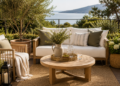
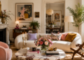
Nothing in it shouts. No single object performs for attention. And yet the eye keeps moving — across a curved arm of a sofa, into the grain of an oak console, along a plaster wall that catches the afternoon light differently than it did that morning.
This is Organic Modern. It is the most imitated interior language of the decade, and the most misunderstood. Most people copy its surface — the linen, the rattan, the beige — and end up with a room that photographs well and feels like nothing at all. The real style lives somewhere else entirely: in restraint, in material honesty, and in a set of proportional rules most people have never been taught to see.
This guide teaches you to see them.
What Organic Modern Actually Is
Organic Modern is often described as “natural materials plus clean lines,” which is true and also almost useless as a definition. That description could apply to Scandinavian design, to Japandi, to coastal minimalism, to a dozen aesthetics that feel nothing alike in person.
The real distinction is this: Organic Modern is a dialogue between geometry and irregularity. Modernism supplies the discipline — clean silhouettes, uncluttered volumes, a limited material palette. Nature supplies the imperfection — the knot in the wood, the uneven glaze on a ceramic vessel, the way linen never hangs in a perfectly straight line.
Neither side is allowed to win. A room that is all geometry reads as cold and corporate. A room that is all irregularity reads as boho or unfinished. Organic Modern sits exactly at the tension between the two, and that tension is what a trained eye is actually responding to when a room “feels right” without being able to say why.
Designer Tip: If you can point to what’s minimalist about a room and separately point to what’s natural about it, the style hasn’t fused yet. In a genuine Organic Modern room, the two qualities live inside the same object — a boucle sofa with an architectural silhouette, a hand-thrown vessel with a perfectly symmetrical form.
How to Recognize It Instantly
Trained eyes read a room in under three seconds. Here is what they’re actually scanning for.
- Silhouettes are soft, structures are precise. Curved sofa arms and rounded table edges sit on top of very disciplined floor plans and symmetrical layouts.
- No more than three visible materials per zone. Wood, plaster, stone — rarely more, and never introduced without a reason.
- Texture replaces pattern. Where a maximalist room uses print, Organic Modern uses weave, grain and glaze.
- Light is warm and low before it is bright. Ambient light dominates over overhead light.
- Negative space is treated as a material. Empty wall and floor are as considered as the furniture.
- Nothing is glossy except stone. Lacquer and high-shine metal are almost entirely absent.
If a room has all six, it’s Organic Modern. If it has three or four, it’s probably drifting toward boho or generic “neutral modern,” which is the imitation, not the original.
Why It Feels Luxurious
This is the part most articles skip, because it isn’t about products — it’s about psychology.
Restraint reads as confidence. A room with fewer, better objects signals that nothing was bought out of insecurity or trend-chasing. Every piece was chosen, which is a form of visible editing, and editing is expensive-looking regardless of the actual price tag.
Imperfection reads as authenticity. Hand-finished plaster, unlacquered brass that will patina, ceramics with visible throwing marks — these materials age instead of degrading. A room built from them looks better in five years, not worse. The eye registers that durability, even subconsciously, as quality.
Warm, low-contrast lighting reads as comfort. Cool white overhead lighting is associated with retail and offices. Layered, warm-temperature light (2700K, never above 3000K) is associated with hospitality — hotels, restaurants, the kind of spaces designed specifically to make people want to linger.
Generous proportions read as space, even in small rooms. Furniture that is slightly lower than expected, with more floor visible around it, makes a room feel larger and calmer than one crammed with correctly-sized but too-plentiful pieces.
None of this requires an unlimited budget. It requires understanding why certain choices work, which is precisely what most decorating advice never explains.
Color Formula: The Organic Modern base palette is built on warm neutrals only — never true white, never cool grey. Start with a wall in warm white or soft greige (something like Farrow & Ball’s “Wimborne White” or a limewash equivalent), ground it with one mid-tone natural material color (oak, jute, or rattan), and add no more than one deeper accent (rust, olive, or umber) per room. Anything beyond three tonal layers starts to compete with itself.
The Material Palette
Materials are the actual vocabulary of this style — get them right and the room works even with inexpensive furniture. Get them wrong and no amount of styling saves it.
The core materials
- White oak — warmer and less formal than walnut, with a visible open grain that reads as natural rather than manufactured.
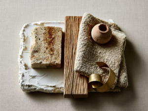
- Limewash and raw plaster — walls with subtle tonal variation and a matte, chalky finish, instead of flat painted color.
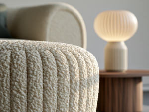
- Boucle, linen and heavy weave cotton — fabrics with visible texture, never smooth or synthetic-looking.
- Travertine and honed limestone — stone with soft veining and a matte finish, used for tables, plinths and occasionally flooring.
- Unlacquered brass and blackened steel — metals that develop a living patina rather than staying showroom-perfect.
- Rattan, cane and jute — used sparingly, as accents rather than as the dominant material, to avoid tipping the room into boho.
Material Pairing: The most reliable combination in the entire style is white oak with warm plaster and one stone surface. This trio alone — a wood floor or piece, a plastered wall, and a single stone tabletop — produces a convincingly expensive room before a single accessory is added.
Why oak feels warmer than walnut here
Walnut is a beautiful wood, but its dark, tight grain reads as formal and traditional — it belongs in libraries and heritage interiors. Oak’s lighter tone and open, visible grain feels closer to raw material and less like “furniture,” which is exactly the informality Organic Modern is built on. This is a proportion-of-warmth decision, not a quality judgment between the two woods.
Color: A Palette With Rules, Not Just a Mood Board
Organic Modern is frequently reduced to “beige,” which is a failure of description, not a failure of the style. The palette is precise.
- Base (60%): Warm white, oatmeal, or soft greige on walls and large upholstery.
- Secondary (30%): Mid-tone natural materials — oak, cane, stone, unbleached linen.
- Accent (10%): One deeper, earthy tone — rust, olive, umber, or aged terracotta — used in a single object, not scattered across several.
The discipline is in the 10%. Most amateur rooms fail not because they choose the wrong accent color, but because they use three different accent colors at 10% strength instead of one at full commitment. A single terracotta vessel says more than a terracotta cushion, a terracotta throw and a terracotta artwork combined.
Lighting: The Detail That Changes Everything
Ask any experienced stylist what separates a photograph-ready room from a lived-in one, and the answer is almost always light, not furniture.
Layer, don’t centralize. A single overhead fixture creates flat, even light that flattens texture — the opposite of what this style depends on. Organic Modern rooms use at least three light sources: an ambient source, a task source, and a low accent source (a table lamp, a floor lamp, or hidden cove lighting).
Stay under 3000K. Anything cooler starts to feel clinical against warm plaster and oak. 2700K is the standard for this style; it’s the same warmth as candlelight and most restaurant lighting.
Let fixtures be sculptural, not decorative. A single well-chosen lamp with an architectural, slightly irregular silhouette — think a hand-formed ceramic base or a woven shade — does more for the room than three matching fixtures ever could.
Styling Rule: One statement light fixture per room, maximum. If the pendant, the floor lamp and the table lamp are all competing for attention, none of them wins, and the room loses the calm it’s built on.
Proportion and Scale: Why This Matters More Than Price
This is the single most underrated principle in interior design, and the one that most reliably separates an expensive-looking room from an expensive room.
Furniture in Organic Modern interiors tends to sit lower than conventional pieces — sofa seats a few centimeters lower, coffee tables slightly longer and lower relative to the sofa, case pieces with more visible leg or plinth than boxy furniture typically shows. Lower furniture opens up more visible wall and ceiling, which reads as space even when the room’s actual square footage hasn’t changed.
Equally important is spacing. Professional stylists leave far more distance between pieces than instinct suggests is “enough” — often 20 to 30 percent more breathing room than a furniture showroom layout would use. That negative space is not empty; it’s doing active visual work, letting each piece register individually instead of blurring into a wall of furniture.
Common Mistake: Buying furniture sized correctly for the room but filling every available surface anyway. A perfectly proportioned sofa loses all of its calm the moment three throw pillows, a blanket, a tray, two candles and a stack of books surround it. Scale isn’t only about the furniture — it’s about what’s allowed to sit near it.
Furniture: Reading Silhouette Over Style Name
Rather than shopping by “style,” train your eye to shop by silhouette. Organic Modern furniture tends to share specific traits regardless of brand or price point:
- Curved over angular — rounded sofa arms, softened table corners, arched mirror and cabinet shapes.
- Low and grounded — pieces that sit closer to the floor rather than perching on thin, high legs.
- Visible material honesty — a wood table shows its grain; it isn’t veneered to hide it. A woven chair shows its weave; it isn’t upholstered over the structure.
- Restrained hardware — cabinet pulls and legs are simple, often in the same tone as the piece itself rather than a contrasting metal.
A useful test: if you covered every label and photographed only the outline of a piece, would it still read as calm and considered? If the silhouette needs the fabric or finish to do all the work, it’s not a strong enough piece for this style.
Styling Rules That Separate Amateur From Expert
The Rule of Three. Group objects — on a shelf, a console, a coffee table — in threes, at varying heights, using at most two of the same material. Pairs feel static; groups of four or more feel cluttered.
One imperfect object per surface. Every vignette needs a single item with visible, honest irregularity — a hand-thrown bowl, an uneven-edged tray, an organically shaped vessel — to offset the precision of everything around it.
Books lie flat, rarely stand. Stacked, horizontal books read as considered; a full row of spines reads as a bookshelf, which is a different (and busier) visual language.
Greenery is sculptural, not decorative. A single olive branch or a dried pampas stem in an interesting vessel does more than a full, leafy houseplant collection, which tends to pull the eye toward color and pattern this style is actively avoiding.
Designer Tip: Step back from any finished vignette and ask what you’d remove first if forced to take one thing away. If there’s no obvious answer, the vignette isn’t finished — it’s just full.
The Most Common Mistakes
Mistake 1: Confusing Organic Modern with boho. Rattan, fringe and heavy pattern belong to a different, warmer, busier aesthetic. The moment texture turns into visible pattern, or natural materials start to dominate rather than support, the room has crossed into boho territory.
Mistake 2: Using true white instead of warm white. Cool, stark white paint fights every warm material around it and pushes the room toward clinical minimalism instead of soft modernism.
Mistake 3: Mixing more than two wood tones in one room. Oak, walnut and pine together read as accidental rather than curated. Pick one dominant wood tone and let any second wood appear only in a small, deliberate accent.
Mistake 4: Overhead lighting as the primary source. This single choice flattens texture more than any other styling decision, and it’s the fastest way to make an otherwise well-designed room feel like a furniture showroom.
Mistake 5: Matching instead of coordinating. A living room where the rug, the cushions and the throw are all the exact same oatmeal tone reads as flat. Coordinating tones with slight variation — oatmeal, warm sand, soft ivory — creates the depth that true matching removes.
Mistake 6: Over-accessorizing. This style photographs as “simple,” but simple is the hardest thing to achieve. The instinct to keep adding — one more candle, one more tray, one more cushion — is the single most common way a well-planned room quietly drifts away from itself.
Applying It Room by Room
Living room: Start with the sofa’s silhouette — curved arms, low back, grounded legs. Layer light with one floor lamp and one table lamp instead of relying on ceiling fixtures. Anchor the coffee table conversation with one stone or wood piece, not both competing for attention.
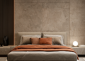
Bedroom: Keep the palette almost entirely tonal — bedding, walls and rug in variations of the same warm neutral — and let one textural element (a boucle bench, a linen headboard) carry the entire visual interest.
Kitchen: Introduce warmth through cabinetry in white oak or a warm painted tone rather than stark white, and let stone countertops do the “luxury” work rather than heavy ornamentation.
Entryway: This is the room where the Rule of Three and the single-imperfect-object principle matter most — a console, a mirror with a soft or arched frame, and one considered vessel say more than a full gallery wall ever will.
The Definition Worth Remembering
Organic Modern is not a shopping list. It’s a discipline: modern structure softened by natural imperfection, warm light instead of bright light, fewer objects chosen with more intention, and enough negative space for the room to breathe.
Anyone can buy a boucle sofa and a rattan mirror. What makes a room actually feel like this — calm, warm, unmistakably expensive without ever announcing it — is understanding why each choice exists, and having the discipline to stop one step before “enough” becomes “too much.”
That restraint is the entire style. Everything else is just materials.